The BFS website had evolved without anyone stewarding the whole. Years of incremental additions (new pages, new sections, retired tools never removed) had produced a site that mirrored BFS's internal org chart rather than the tasks its 1,200+ staff users were actually trying to complete. Pages linked to legacy Oracle systems that no longer existed. Navigation labels reflected department names, not user goals. And because there was no shared ownership model, no review cadence, and no standard for what a good page looked like, the problem compounded silently over time.
Google Analytics confirmed the pattern: large portions of the site received almost no traffic. Not because the content wasn't needed, but because users couldn't find it. The issue wasn't any single broken page. It was a system that had no mechanism for staying current.

A representative page before revamp: references to retired processes, internal-facing language, no clear user pathway.
Broken and outdated links.
Many pages linked to retired tools, including legacy Oracle systems, creating dead ends users had no way to navigate past.
Navigation built for the org, not the user.
Site structure mirrored internal BFS departments rather than the tasks users were trying to complete, making information hard to find without prior knowledge of how BFS was organized.
Inconsistent content quality.
Pages varied widely in structure, tone, and accuracy. Quality depended entirely on which team owned a page, with no shared standard to anchor against.
No maintenance system.
Without clear ownership or review cycles, outdated content stayed live indefinitely. There was no mechanism for keeping the site current, so any cleanup would be a one-time fix, not a durable solution.
02
Phased, data-driven, built to last
I led weekly working sessions with 15+ subject matter experts, conducted the majority of page revamps, and created and maintained the reporting system tracking what was done, in progress, and still needed attention. The work was phased. Not everything at once, but prioritized by where users actually were, not what seemed most outdated internally.
~90%
Page update completion
15+
SMEs onboarded to Figma
1
Audit and map
Full site inventory in Figma, color-coded by status, organized by owner, with V1/V2 layouts side by side for review. I built and maintained a parallel Google Sheets tracker that logged every page's progress from authorship confirmation through CMS sign-off, making it easy to see at a glance what was done, what was blocked, and what was next.
2
Prioritize with data, not requests
Analytics drove sequencing: high-traffic pages (Merchant Equipment, Payment Cards, Student Receivables) were updated first so improvements reached the most users fastest. Low-traffic sections were flagged for consolidation or archival. This meant some pages that departments flagged as urgent got deprioritized; others that looked fine on the surface were heavily visited and long overdue. Stakeholder preference wasn't the sequencing model; user behavior was.
3
Lead working sessions and ship
I ran weekly review meetings with 15+ SMEs, equal parts progress check and content education. SMEs learned to think about web content differently: how to write for users rather than internal audiences, when to link vs. duplicate, and how to flag when something needed compliance review. Content was implemented in BLINK CMS and routed through final review before going live.
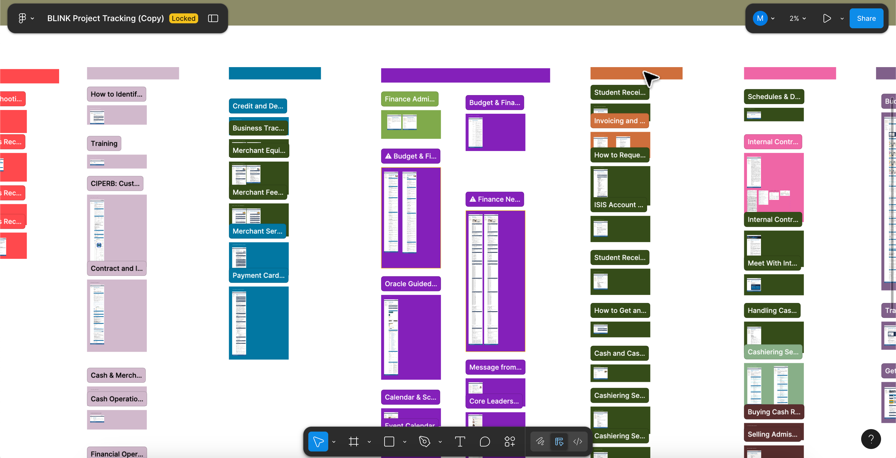
Figma canvas used as the weekly collaboration artifact. Color-coded by status, organized by owner, V1/V2 layouts side by side.
From org chart to user task: the most consequential structural change was reorganizing navigation away from BFS's internal department hierarchy.
The existing structure labeled sections by team name, which made perfect sense to the people who built it and was largely invisible to everyone else. Rewrites and restructuring across Finance and Accounting reoriented pages around what users need to do, not which department owns the content.

Content and page updates were structured into phased rollouts, prioritized and sequenced based on analytics and page traffic patterns.
The decision
Departments consistently pushed for their section to be updated first. Instead, the team anchored sequencing entirely to analytics: which pages were users frequently visiting, where were they dropping off, and what was creating dead ends. That meant some high-visibility internal sections got deprioritized in favor of less prominent pages that turned out to be major user entry points. Stakeholder trust in that call came from showing the data, not overriding the request.
What we shipped.
- Figma site map and collaborative review workspace: full visual inventory with status tracking and before/after comparisons across all sections
- Google Sheets project tracker: page-by-page progress log across authorship, editing, staging, CMS implementation, and sign-off
- Video content audit: inventory of BFS finance training videos with view counts, upload dates, and archival recommendations
- Restructured information architecture: reorganized navigation and page hierarchy from department-based to task-based across Finance & Accounting
- Plain-language content rewrites across high-priority pages including Merchant Equipment, Accounts Receivable, and Budget & Finance
- SME onboarding and process documentation so BFS could continue the work and maintain standards independently
The consolidation approach piloted here, which unified multiple fragmented support pages into a single authoritative hub, was also implemented in parallel in the BFS Support Hub project, reducing support entry points from more than four competing pages to a single centralized destination.
Reflections
Working on a large institutional website, I realized pretty quickly that the challenge wasn't just the design itself, but the organizational dynamics underneath it: distributed ownership, inconsistent standards, no shared language for what "good" looks like, and no process for keeping things current.
The design work mattered: the IA restructure, the content rewrites, the Figma workspace. But what made it actually ship was the operational layer: working closely with SMEs through weekly Zoom revision sessions and one-on-one meetings, walking them through the tools and workflows, sharing best practices, and helping translate their requested edits into actionable updates, then implementing those changes directly in the CMS.
During my time at BFS, I learned how critical this layer is, both before and during an iterative cycle. It is what turns design systems and processes into something that actually gets used and maintained.