
April 2025 - June 2025
Playful, indulgent vegan food packed with flavor and made with love.
Founded by Fernanda and Michael, inspired by Fernanda’s daughter Valentina, Val’s Vegan Kitchen was born from a personal journey to embrace veganism fully — out of love for animals, food, and people. With roots in Ireland and Brazil, their cooking reimagines nostalgic, comfort-filled dishes into vibrant, plant-based creations that satisfy vegans and non-vegans alike.
Their mission is simple: make vegan food joyful, flavorful, and approachable — proving that compassion and indulgence can go hand in hand. Every dish blends creativity, global inspiration, and the warmth of home cooking, inviting everyone to share in a kinder way of eating.
.svg)
Val’s Vegan Kitchen is a mom-and-pop restaurant that had been managing its inventory entirely through memory and scattered notes. This method proved inefficient—especially during rush hours or when ingredients ran low unexpectedly. The owner expressed a clear need for a lightweight, intuitive system that could help organize inventory by both type and location.
We designed a mobile-first inventory platform tailored to small kitchens, enabling users to input stock and quickly reference what's on hand. The result was a categorized, visual layout that streamlined daily operations without introducing unnecessary complexity—ideal for a kitchen where time and clarity are everything.
We visited the restaurant in person and closely observed the owner's daily workflow and behaviors. This firsthand insight helped us uncover key considerations that directly shaped our design decisions.

.png)
.png)
.png)
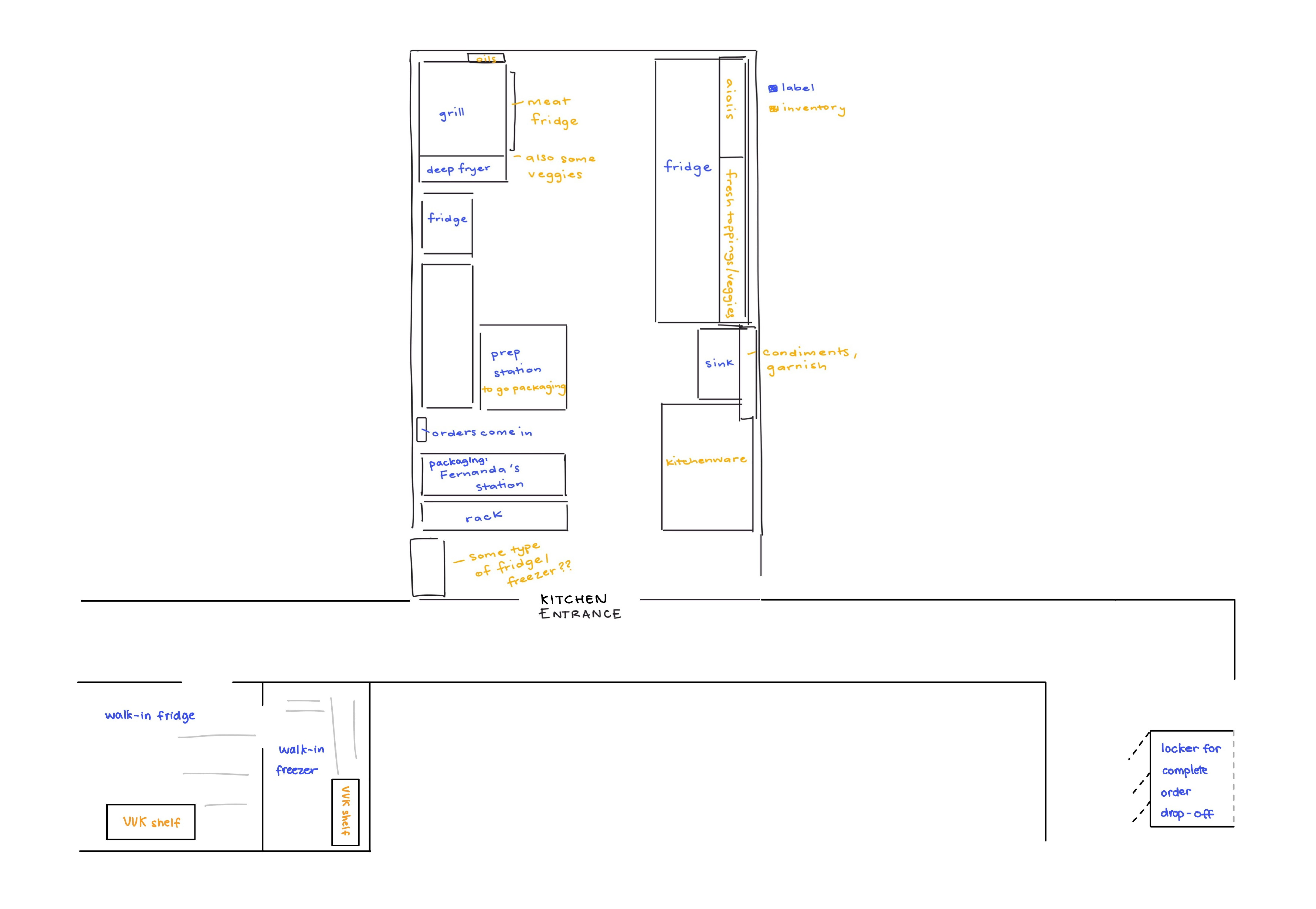
The core problem was the complete absence of a structured inventory system, leading to under-ordering, food waste, and challenges keeping track of expiration and past order dates. The owners needed a tool that mirrored how they already worked—fast, clear, and physical—not something overly technical or reliant on desktop screens.
A major design challenge was accounting for ingredients that existed in multiple forms and locations (e.g., carrots could be chopped in the fridge, whole in the pantry, or frozen in bulk). Our system had to be flexible enough to reflect this complexity without becoming confusing or unmanageable.
Our users were the restaurant’s co-owners and any future employees. Their needs centered around speed, minimal training, and high visual clarity. The system had to feel like an extension of their workflow—not an obstacle to it.
Shown to the right—a sketch I did of the restaurant layout. Hover and scroll for a closer look.
We followed an iterative, user-centered process designed to accommodate the kitchen’s pace and constraints. Our steps included:
We ultimately landed on a card-based UI for its quick scanability and compatibility with small screens.
Key features included:
The prototype was tested directly with the restaurant owners, who found it easy to use, mentally freeing, and highly practical for their day-to-day needs. They especially valued the ability to instantly view low-stock items across different storage areas. Plans for the next phase include testing in live conditions and expanding features like batch tracking and low-stock alerts.
As a designer, this project taught me how to balance usability with the inherent complexity of real environments. Simplicity, in this case, wasn’t just a stylistic choice—it was the difference between something used once and something used every day.