ADGScribe.ai: AI Medical Scribe

ADGScribe.ai

A clinical documentation tool designed to keep physicians present in the room. I shaped the UX for a system that transcribes patient encounters, structures notes into the clinician's format of choice, and surfaces the right context at the right moment in the clinical workflow.

Role
UI/UX Designer
Timeline
October 2025 to March 2026
Team
Product, Engineering, Clinical Advisors
Focus
UX Strategy, Information Architecture, Content Design
01

The average physician spends two hours documenting for every hour with a patient

That imbalance doesn't just create burnout. It erodes the quality of care itself. Manual note-taking during consultations reduces eye contact and patient trust, while post-visit documentation stretches into personal time.

Existing tools either required full manual transcription or generated notes so rough they needed heavy editing before meeting clinical standards. Neither respected how physicians actually work.

Documentation burden
Notes spill past the workday, often taking 1 to 2 extra hours per day.
Fractured attention
Manual note-taking during appointments reduces eye contact and diminishes patient trust.
Context-switching
Fragmented workflows forced constant movement between patients, notes, and schedules.
Unreliable AI output
Existing AI tools produced drafts that required significant manual correction before use.
02

Why AI documentation is genuinely hard to design

Designing an AI scribe is not a standard productivity problem. Clinical notes are legally and financially consequential. A missed medication, a misattributed symptom, or an incorrectly structured code can affect diagnosis, billing, and liability. The AI output has to be trustworthy enough to use quickly and editable enough to correct without friction. And the person using it has almost no tolerance for extra steps.

Accuracy at stake
Errors in clinical notes are not cosmetic. They affect diagnosis, billing codes, insurance reimbursement, and in some cases patient safety. The system had to make it easy to catch mistakes, not just generate output.
Zero tolerance for friction
Physicians context-switch constantly. Any interface that adds cognitive load during a session actively makes their job worse. The design had to feel invisible in motion.
Trust has to be earned
Physicians are professionally liable for what they sign. They will not accept AI output they cannot verify quickly. The system had to surface confidence, not just completeness.
Messy, unstructured input
Real clinical conversations are multi-speaker, nonlinear, and full of jargon. Whichever template a clinician chose, from SOAP to a custom format, the output structure had to be reliable regardless of how the input came in.
03

An AI scribe built for the flow of clinical work

ADGScribe.ai automatically transcribes patient encounters, generates structured notes in the clinician's preferred format, from SOAP to specialty-specific and fully custom templates, and surfaces the right patient context at the right time. I worked across UX strategy, information architecture, and content design to make sure the system supported physicians without asking them to adapt to it.

Structured templates over verbatim transcription
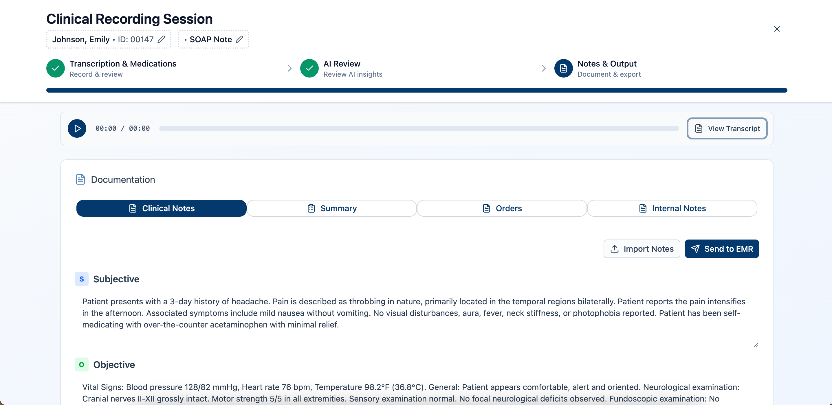
Raw transcripts dump everything and ask physicians to do the work of structuring it. We offered a range of note formats, including SOAP, other standard templates by encounter type, and fully custom templates clinicians can build themselves. The structured output maps to how clinicians already think and document, reducing review time and making notes immediately usable. Because the AI makes structuring decisions the user might disagree with, every field in the notes screen is editable.
Recording as the homepage
In early layout explorations, the home screen showed a dashboard of recent sessions and upcoming appointments. User feedback from physicians made clear that the active recording state was the primary job to be done. Anything that required navigation to start recording added unnecessary cost. The homepage became the recording interface.
System state surfaced before the session starts
A mid-session failure, such as the AI going offline or transcription stopping, is significantly more disruptive than knowing before you walk in that something is wrong. The "Online" status indicator was placed in the primary nav so physicians could confirm readiness before entering the exam room. Prevention over recovery.
Templates over freeform
Encounter types vary enough that a single note format would either be too sparse for complex visits or too cluttered for simple ones. Clinicians choose from a library of standard templates by encounter type, including SOAP, or build and save their own, so the AI output slots into whatever structure they already think in rather than a fixed default.
04

Structuring the information architecture

One of my primary contributions was defining the navigational structure and content hierarchy. The challenge: surface enough context to be useful at a glance, without overwhelming a physician mid-workflow. Below is each surface, the job it had to do, and the tradeoff that shaped it, not just the finished screens.
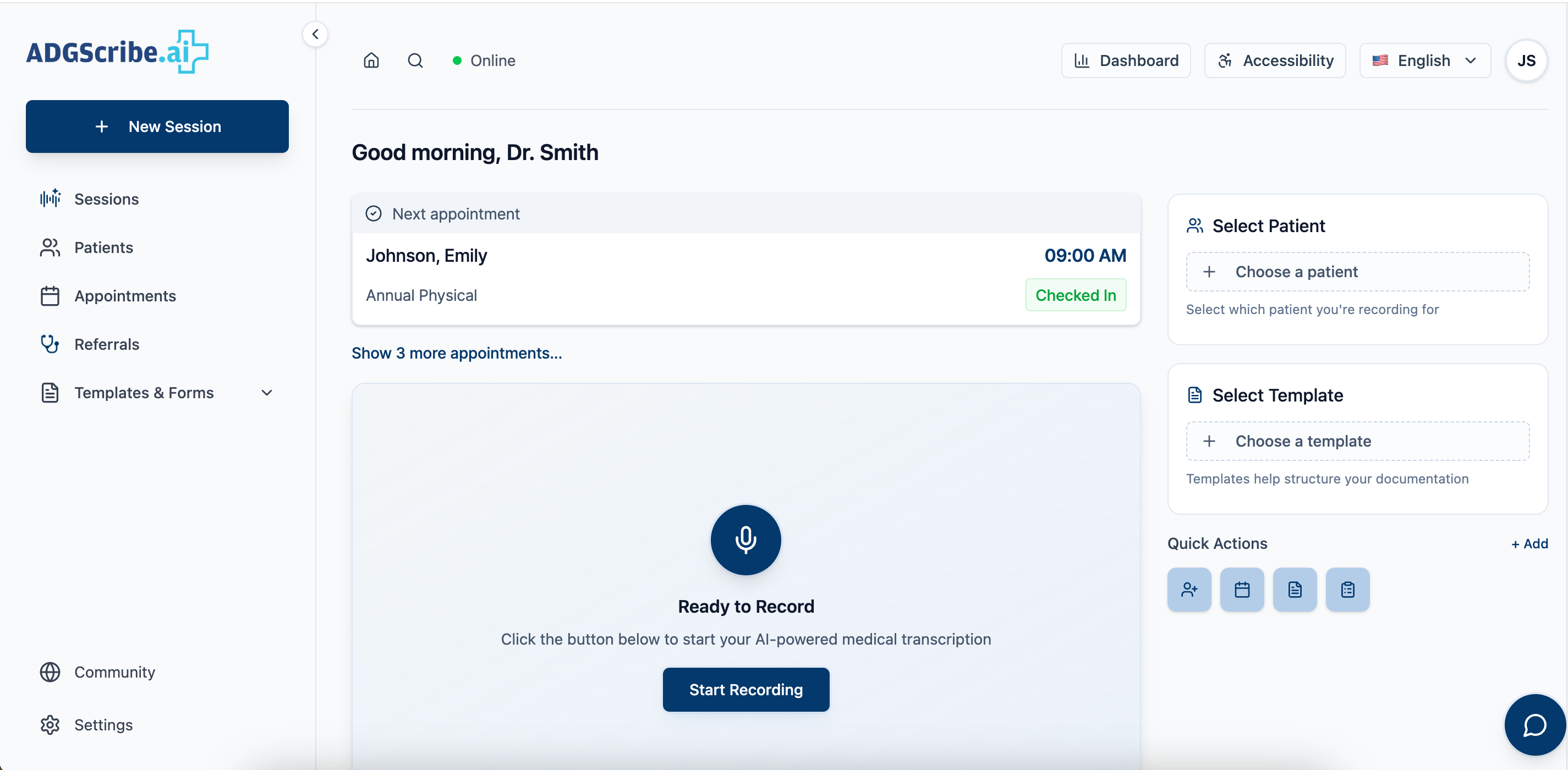
Home
Task
New Session has to be the very first thing available. Physicians open the app mid-conversation, not before one.
Tension
A dashboard or launcher screen adds a click before recording can even start.
Resolution
Home and the recording screen are the same surface. The persistent left nav keeps everything else one click away without ever competing with it.
Home screen
Recording Flow
Task
Carry the encounter from raw audio to a usable note without adding steps.
Tension
Different people need different views of the same encounter: the physician signs the note, a biller checks the summary, someone else pulls prescriptions.
Resolution
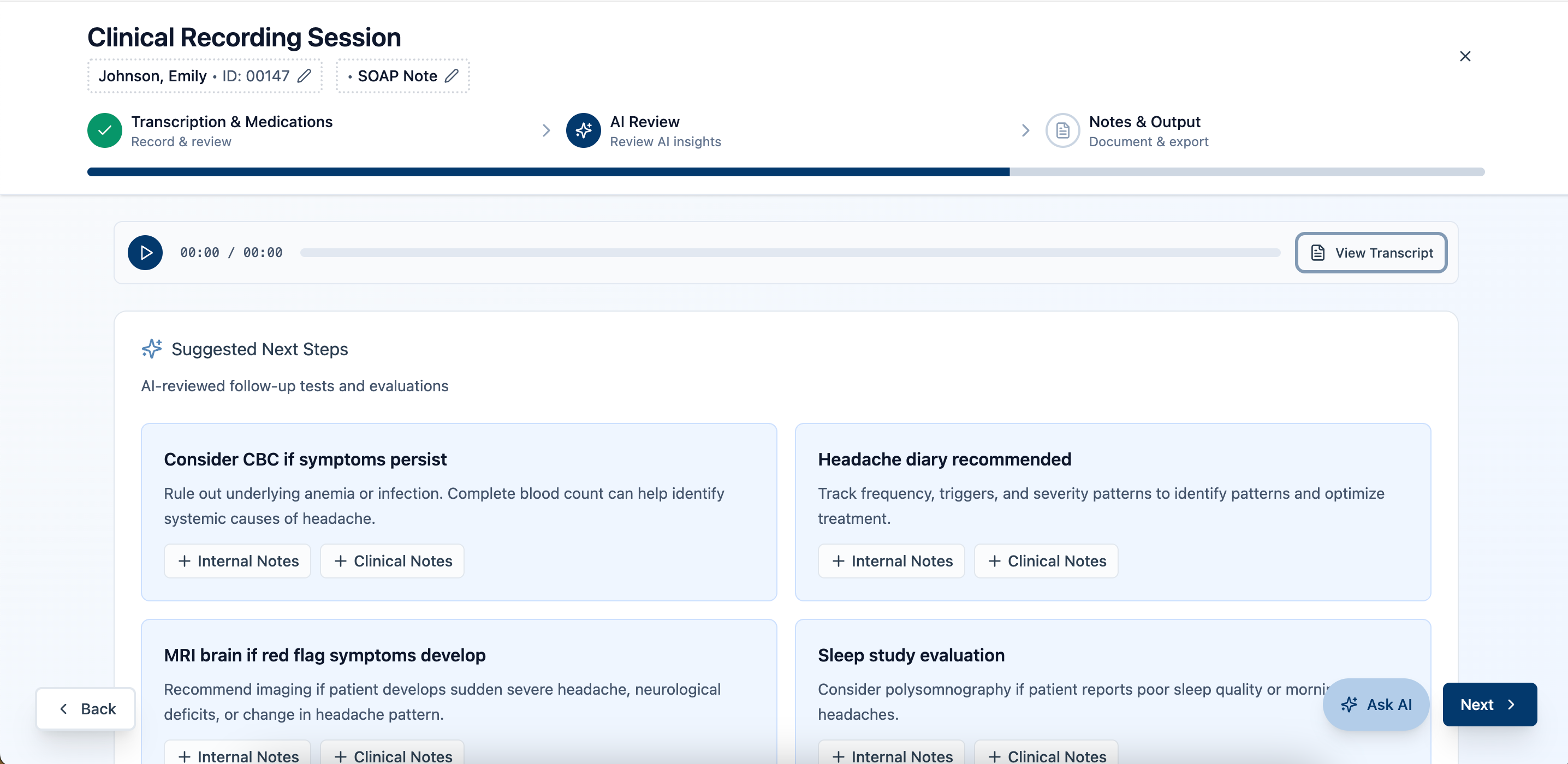
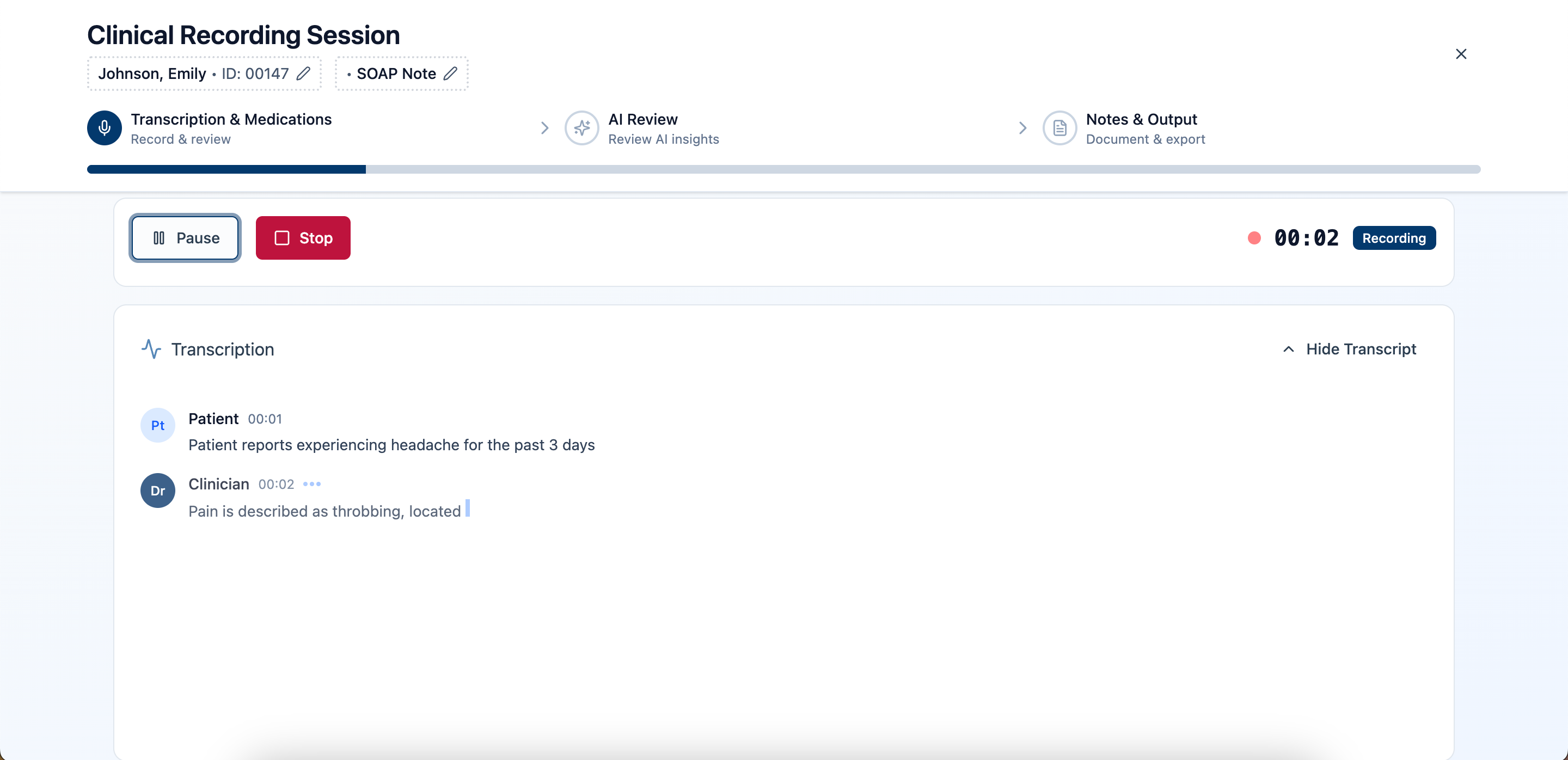
One continuous surface: capture, speaker-labeled transcript, Generate Notes, then a four-tab workspace (Clinical Notes, Summary, Prescriptions, Diagnostic Coach), with a template swap always available inline.
Live transcription
Active recording: timer, waveform, and the three controls that are the only decisions available mid-session.
Medication capture
Speaker-labeled transcript, with Generate Notes as the single next step.
AI Review
Diagnostic Coach tab: AI-suggested treatment plan and medications, generated from the same transcript.
Notes output
Clinical Notes tab: structured note ready for review, with the template swap always available.
scroll to see more
Sessions
Task
Let a physician scan and find a past visit fast.
Tension
This is a reference surface, not a working one, but destructive actions still live here.
Resolution
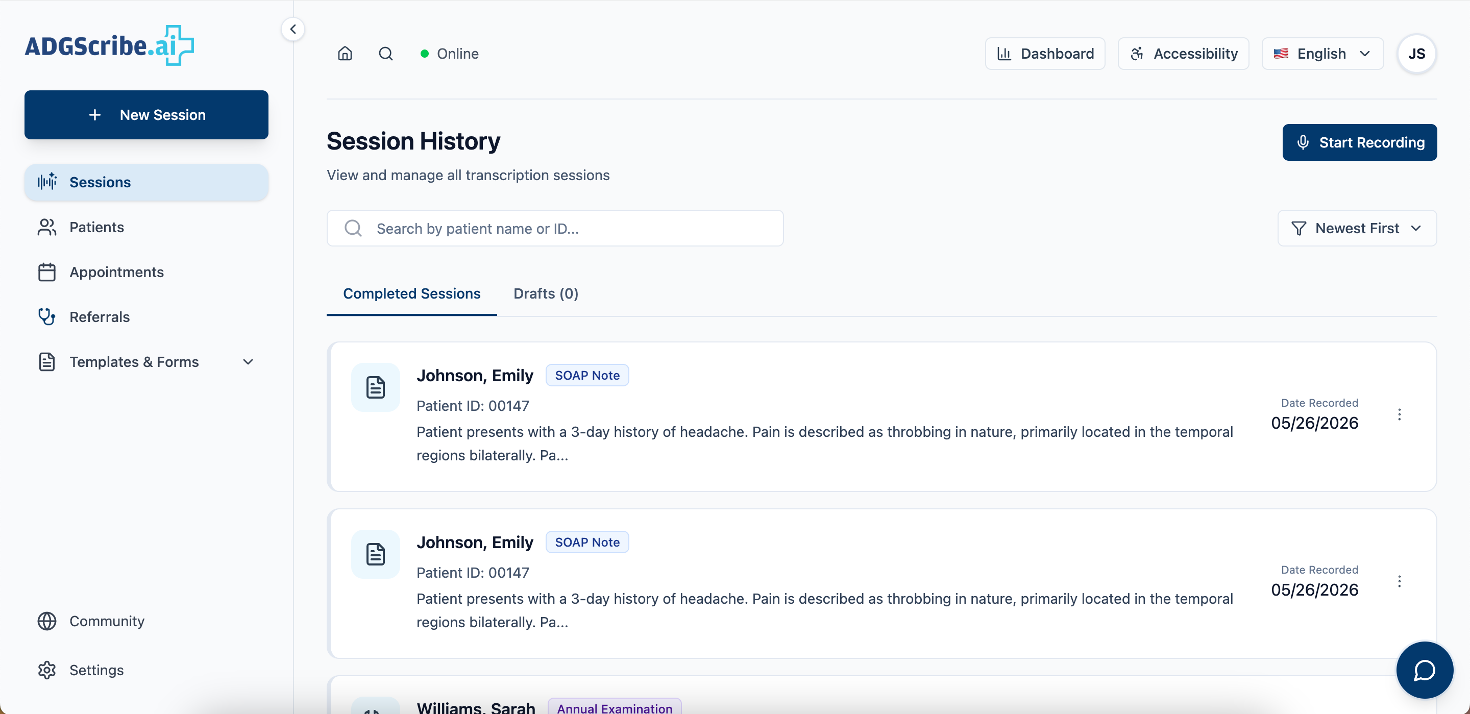
A plain table beats cards for scanning. Edit, View, and Delete sit behind a row menu, so deleting a clinical record takes one extra tap, on purpose.
Session history
Session history: a scannable table, with row actions tucked behind a menu rather than exposed inline.
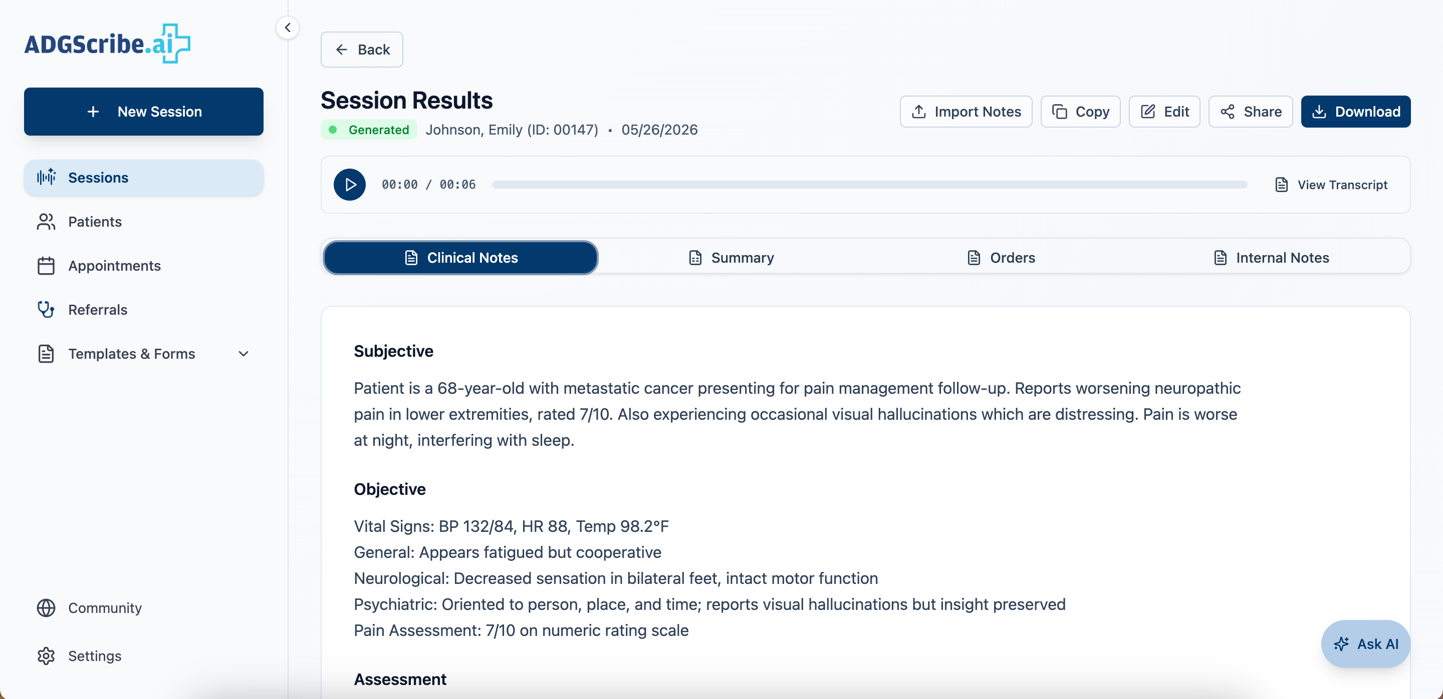
Session recording playback
Session recording: playback view with timeline and notes.
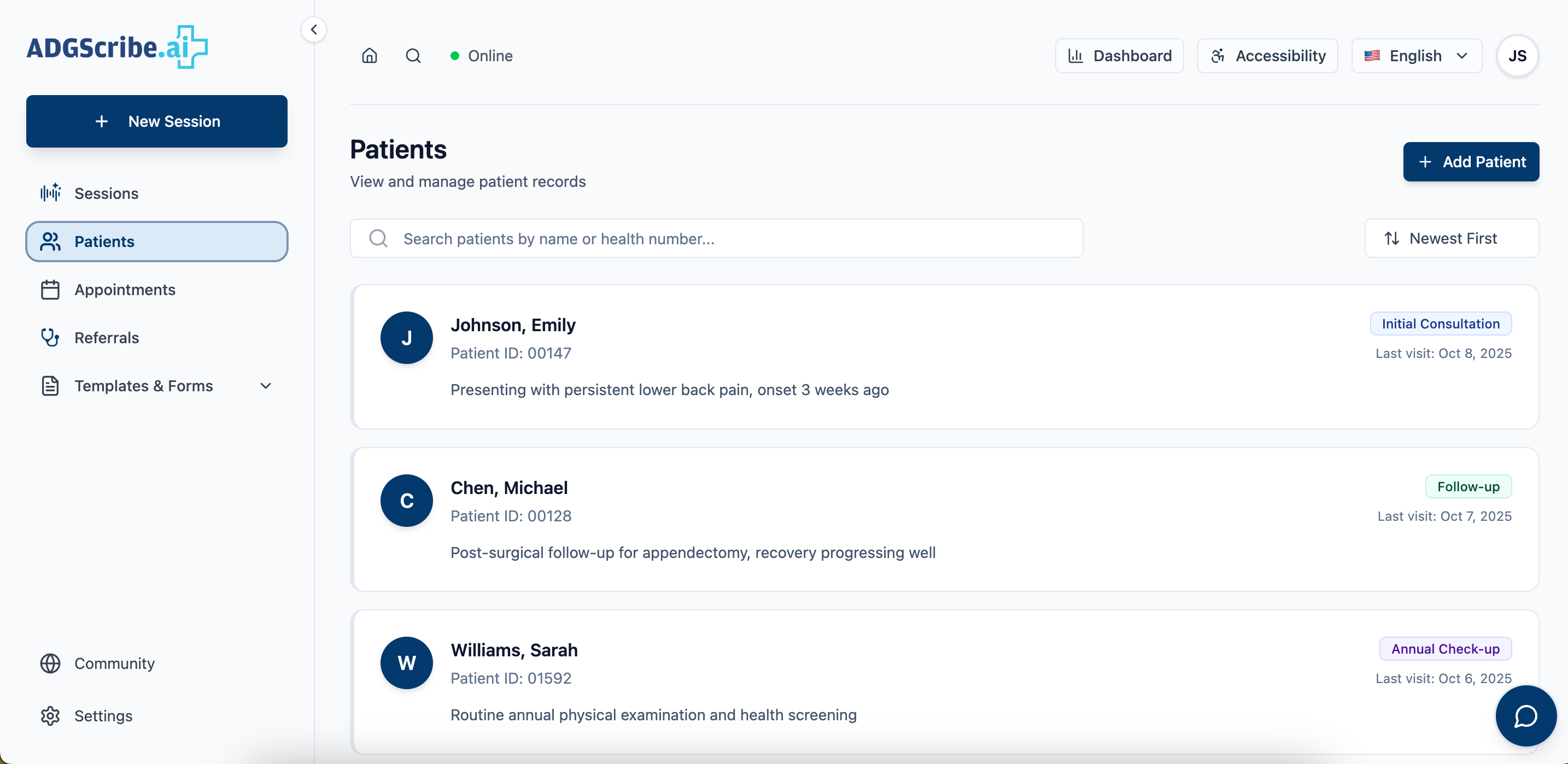
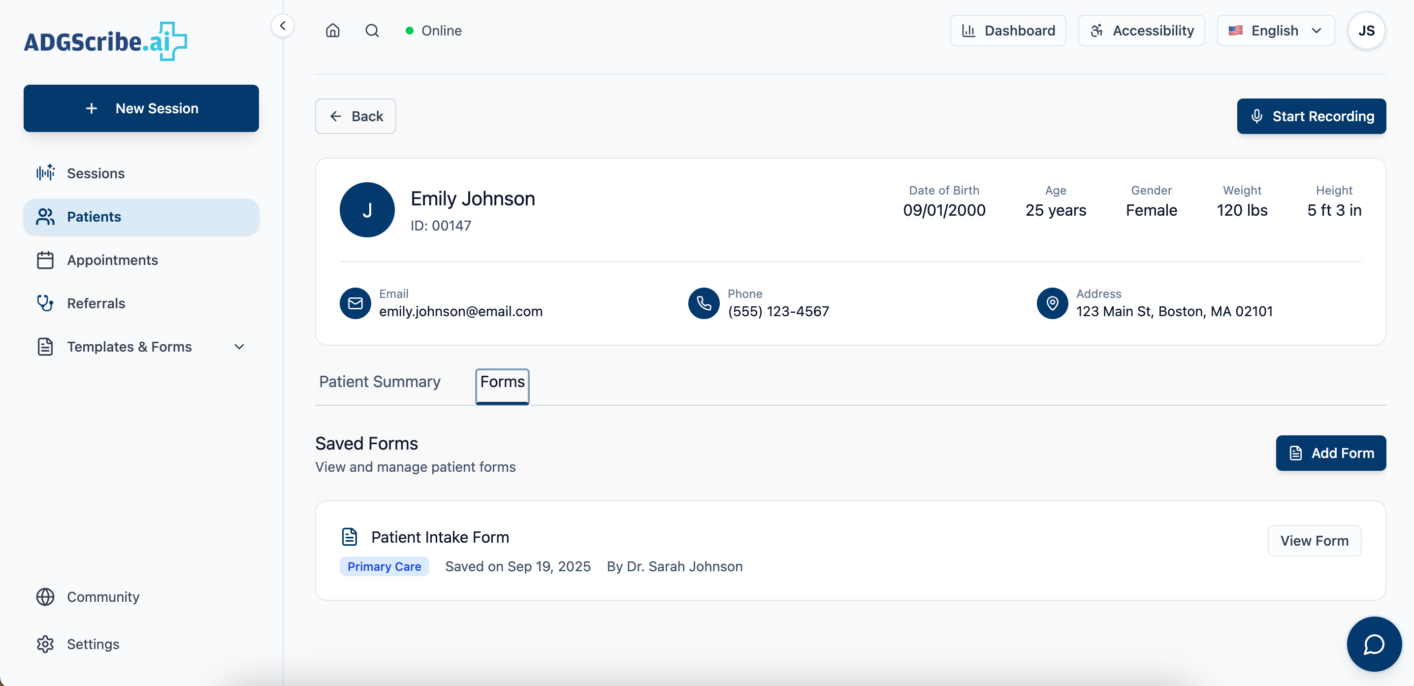
Patients
Task
Support both a five-second lookup between patients and a five-minute review before a complex visit.
Tension
One data set, two very different reading speeds.
Resolution
A compressed directory card by default, with the fuller record one click away rather than shown up front.
Patient directory
Compressed directory view, built for a fast lookup between patients.
Patient detail
Patient detail: health status, upcoming appointments, and forms surfaced together.
Patient detail extended
Extended view, one click deeper, for when a visit calls for it.
scroll to see more
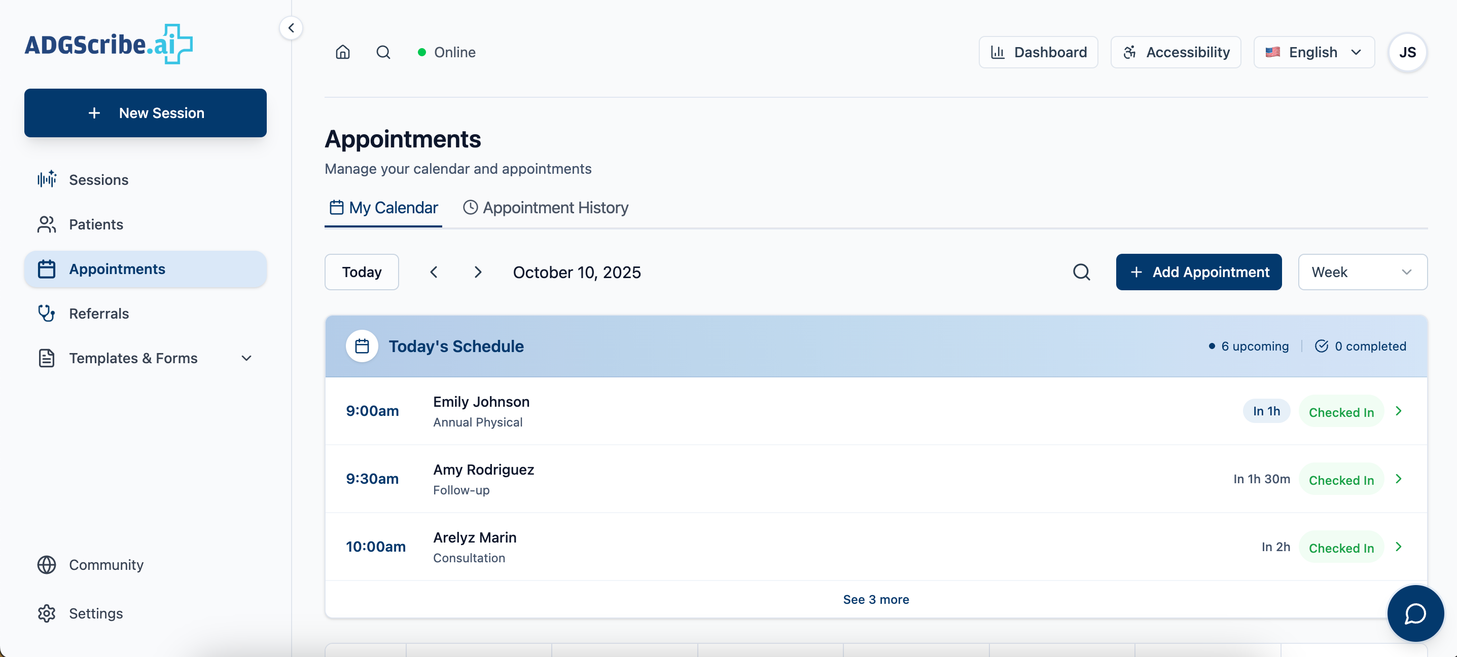
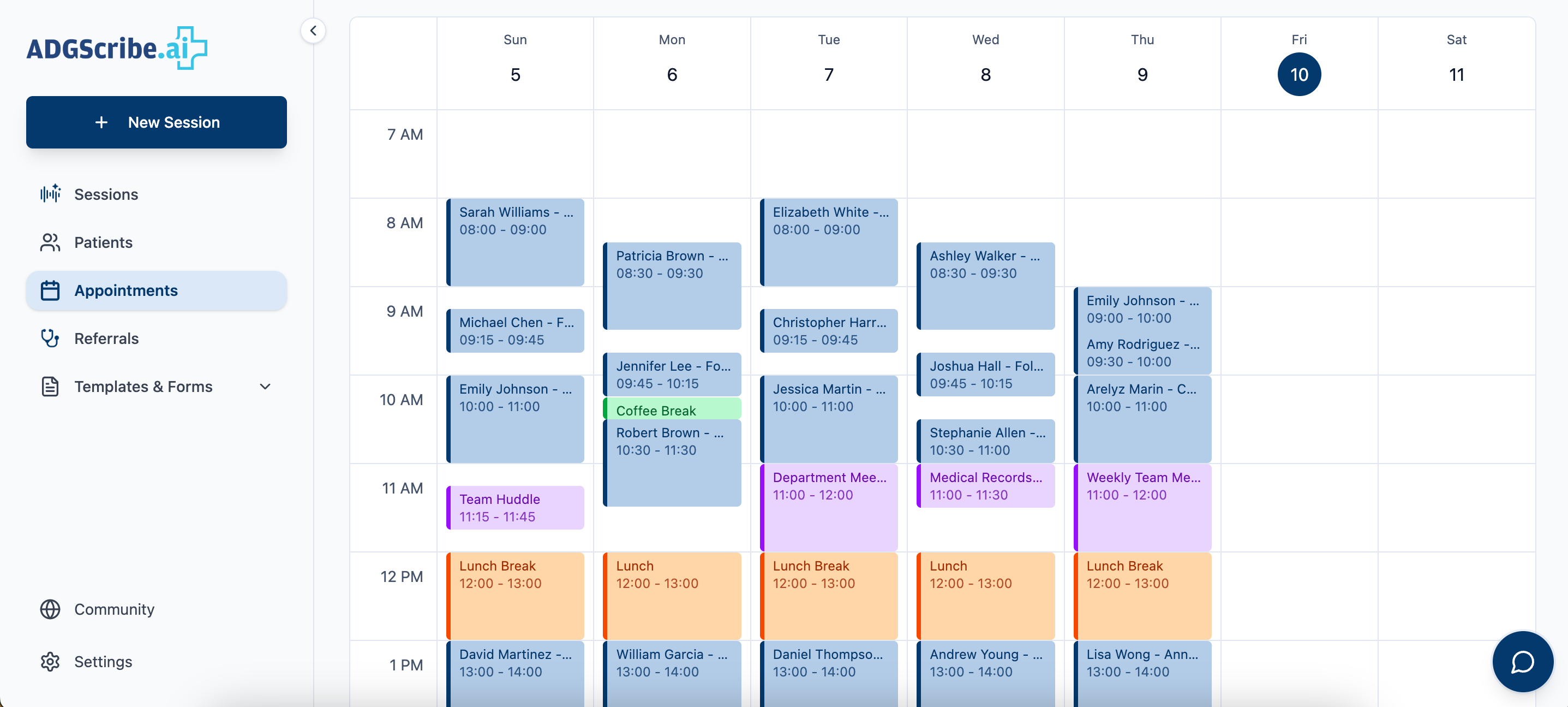
Appointments
Task
Show what's coming up without burying it under what already happened.
Tension
A single combined list would bury today's schedule under weeks of history.
Resolution
Two tabs: My Calendar, which defaults to today, and a separate filterable Appointment History for looking backward.
Daily schedule
My Calendar: month grid plus the selected day's agenda, defaulting to today.
Weekly calendar
Weekly calendar: structured overview of patient flow across days.
Appointment history
Appointment History: a separate filterable table for looking backward.
scroll to see more
Referrals
Task
Get a patient to the right specialist without creating unnecessary records.
Tension
A referral is a real handoff with real liability, so the flow can't start with a form.
Resolution
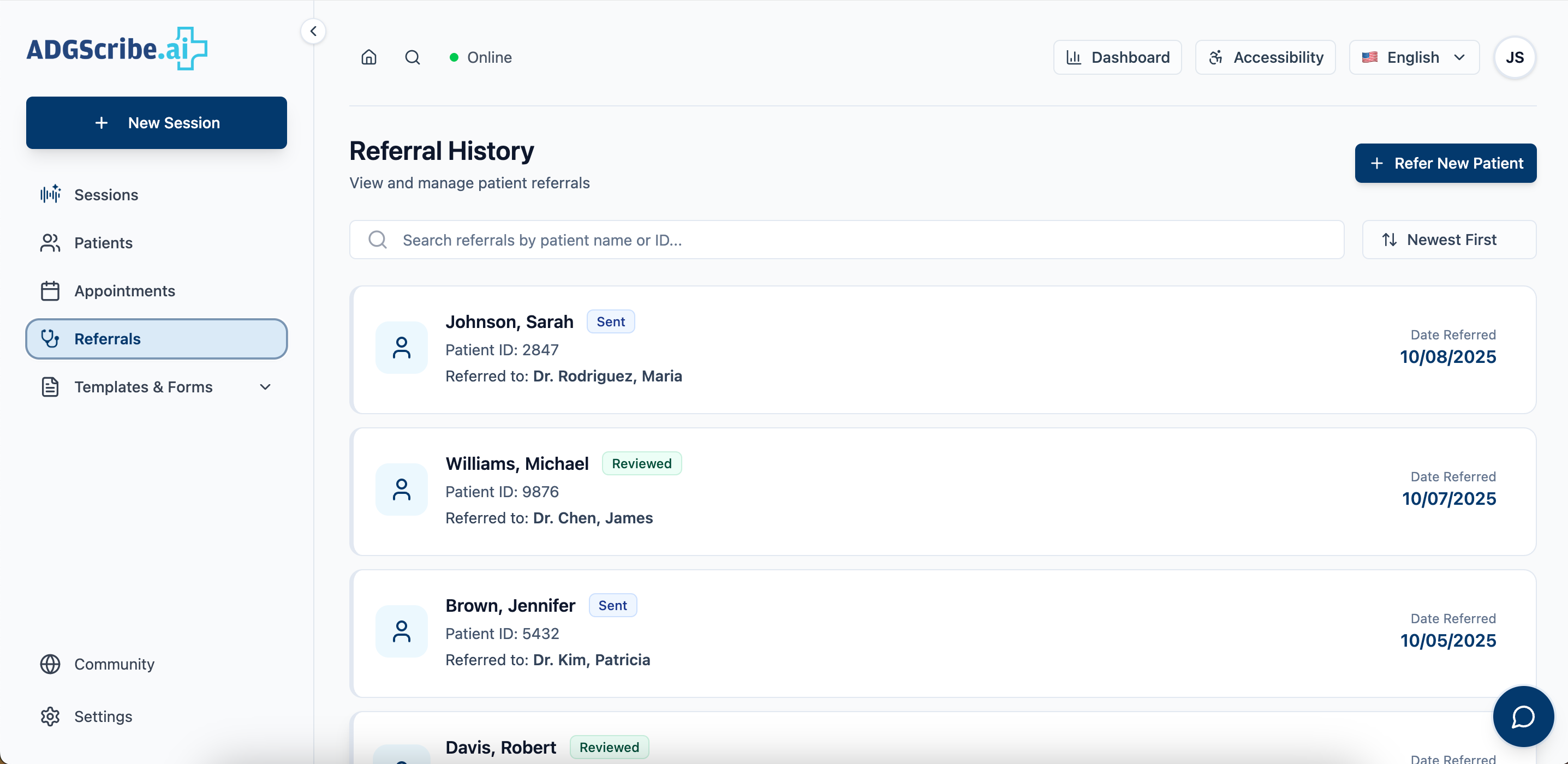
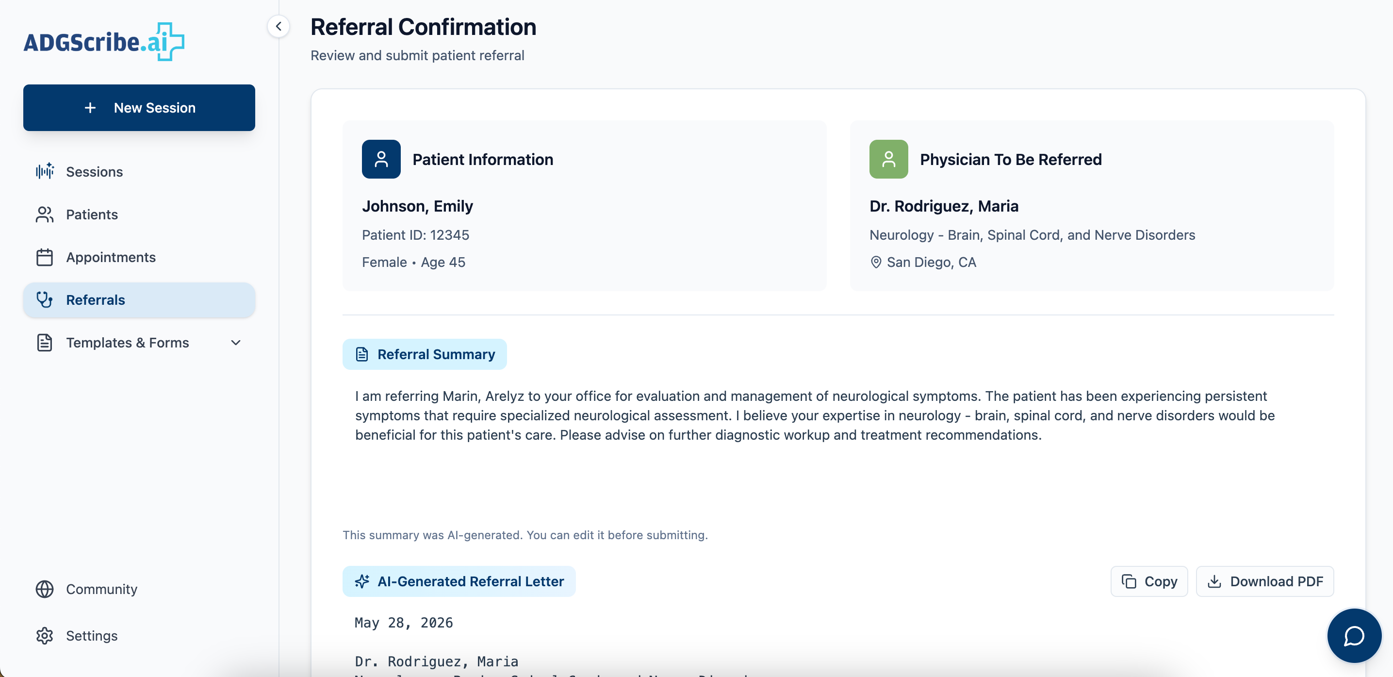
Provider search and filters come first, then a profile to confirm fit, then the referral itself. The confirmation screen offers to start another rather than assuming the physician is done.
Referral overview
Referral History: status at a glance, Sent, Reviewed, or Withdrew.
Referral detail
Referral detail: status, documents, and communication history.
Templates & Forms
Task
Support choosing a template mid-encounter and managing the library, two different jobs.
Tension
Forcing both into one navigation model slows down whichever isn't the current priority.
Resolution
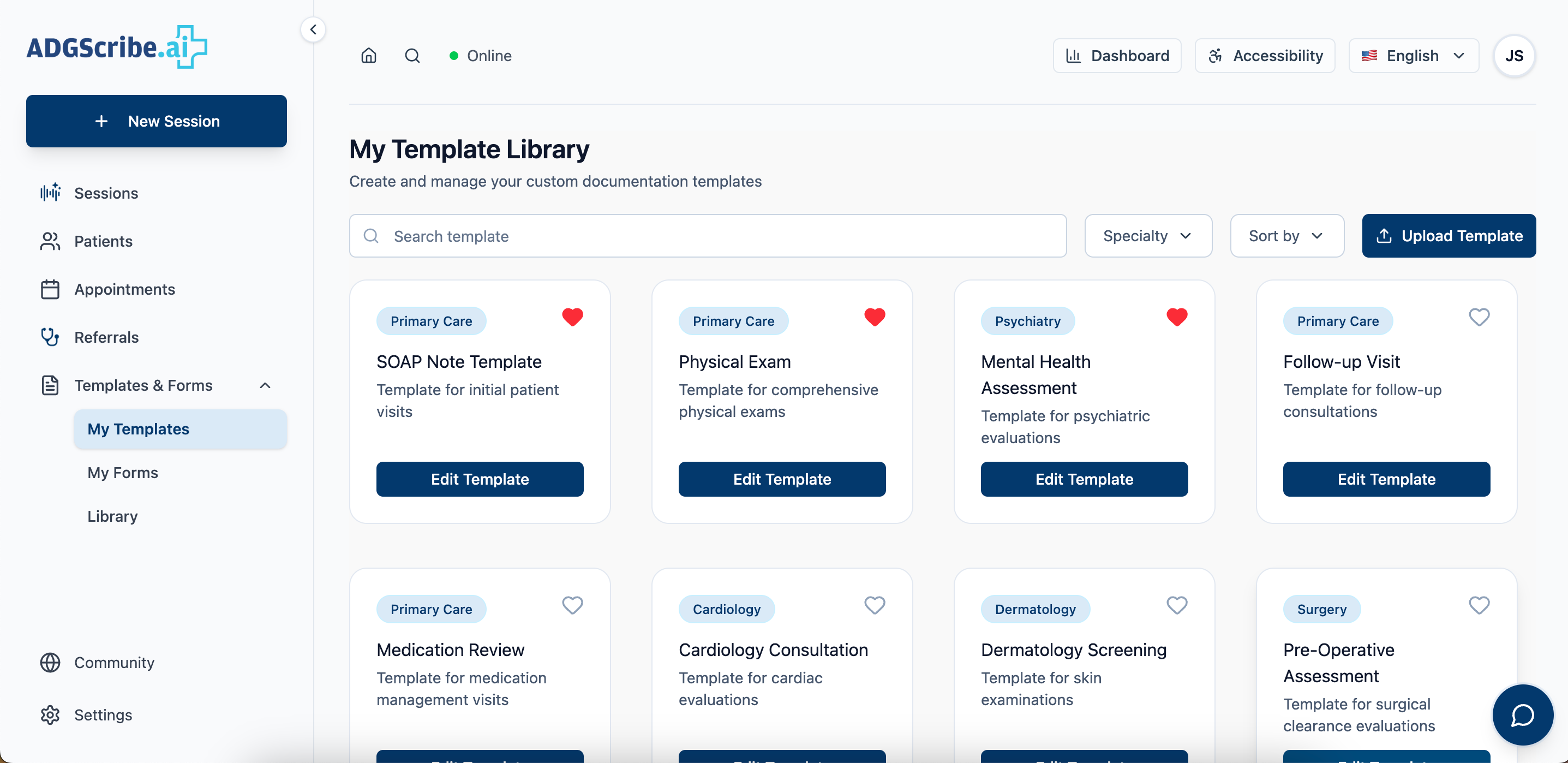
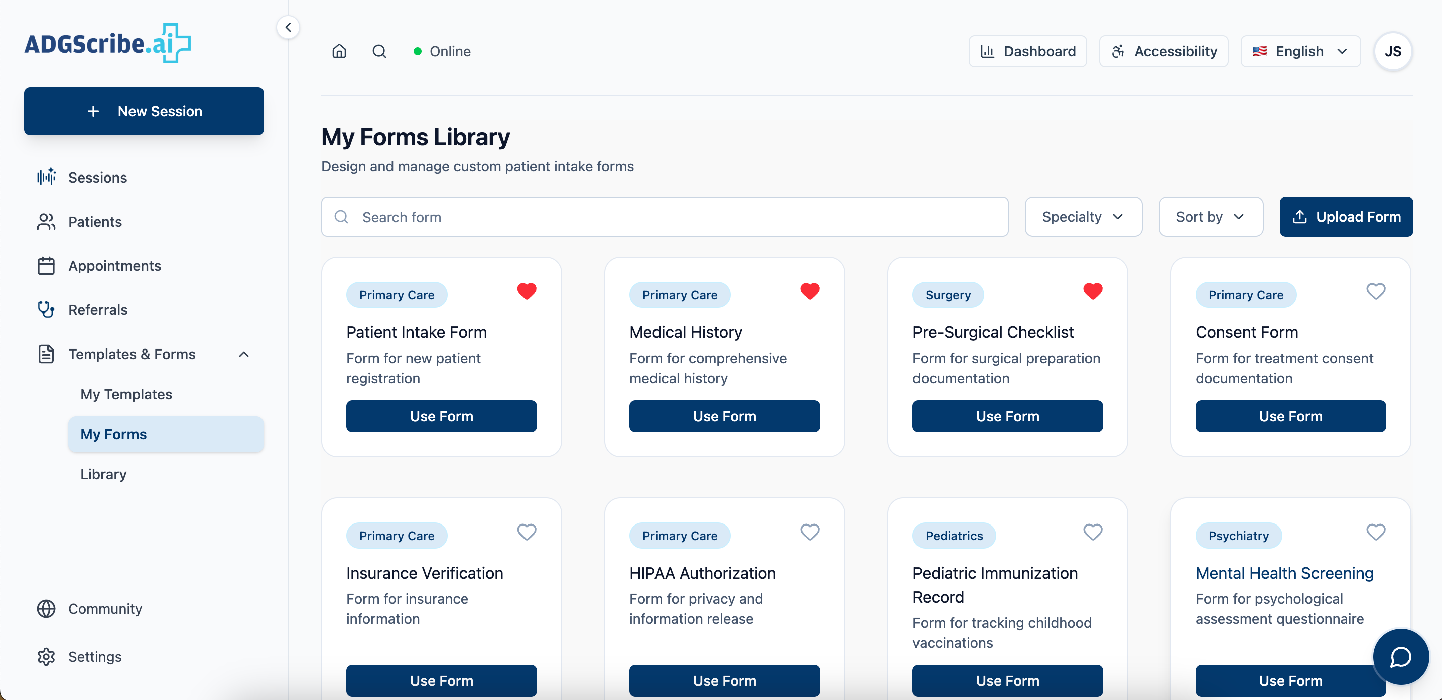
A searchable dropdown inline for fast swaps, plus a standalone library with custom letterhead upload for managing forms.
Template selection
Searchable template dropdown, reachable from inside an active note.
Form selection
Form selection: encounter-specific forms tailored to visit type.
Library
Library view, plus custom letterhead upload for branded output.
scroll to see more

By aligning each section to a real task in the clinical day, the system reduces context-switching and keeps attention on the patient, where it matters most.

View prototype
05

Content designed around how physicians actually work

Clinical software is often written for the teams who manage it, not the people who use it daily. The content approach here was the inverse: plain language, action-oriented, with system state surfaced proactively so physicians are never caught off guard mid-session.

Plain language in clinical contexts
Labels like "View and manage all transcription sessions" confirm location without adding cognitive load. In high-pressure environments, the interface should demand zero interpretation.
Action-oriented CTAs
"Start Recording" and "+ New Session" are unambiguous. In time-sensitive workflows, physicians shouldn't pause to interpret what a button does.
Status as orientation
The "Online" indicator tells physicians the AI is ready before they enter the exam room. Surfacing system state proactively prevents mid-session surprises.
Accessibility from the start
Accessibility controls sit in the global nav alongside language selection, signaling that these aren't afterthoughts but first-class features of the system.
06

A full design system handed to engineering

We completed and handed off a full design iteration to engineering across all six core surfaces: home, recording flow, sessions, patients, appointments, and referrals. The work was grounded in real feedback from physicians, doctors, and medical billers throughout the process, validating that the system mapped to actual clinical workflows rather than an idealized version of them.

Physician feedback confirmed that structured note templates reduced post-visit review time and that the recording-first homepage matched how they actually entered the tool. Templates were validated as useful by billers, who flagged that encounter-specific structure reduced coding errors on their end.

6
Core surfaces designed and handed to engineering
2
Full design iteration cycles with stakeholder review
3
User groups validated with: physicians, doctors, medical billers

A few things this project left me with.

Working on this project shifted how I think about an entirely different profession. Not just what physicians do, but how their workflows are structured, how medical coding actually functions behind the scenes, and how much clarity matters in fast-paced clinical environments. It made me think more intentionally about IA, especially in how CTAs are organized to make something complex feel immediately graspable.

Something as small as a mislabeled section or a buried action isn't just a usability issue in this context. It can mean a delayed note, a missed detail, or a physician staying late to finish documentation that should have happened in the room. That weight changed how I approached every labeling and hierarchy decision on this project.